THE CHILD OF “SPÄTI” AND “REFORMHAUS”
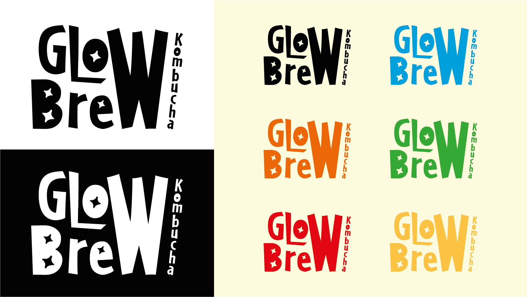
Client: GLOW BREW KOMBUCHA Role: CONCEPT & DESIGN Agency: PERSONAL PROJECT
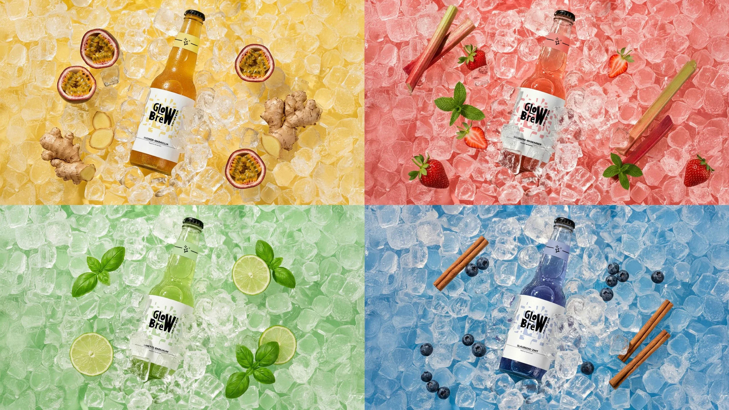
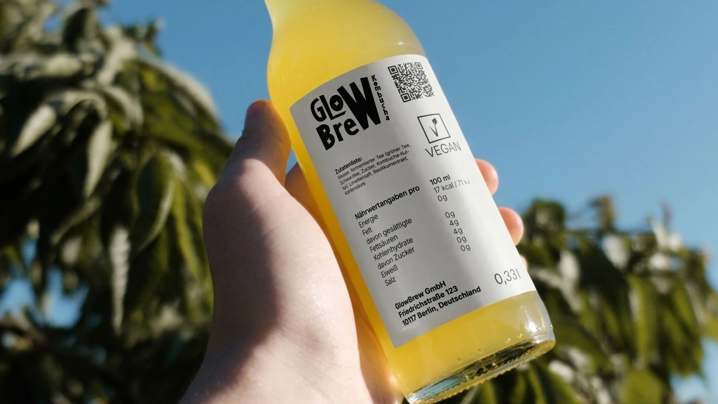
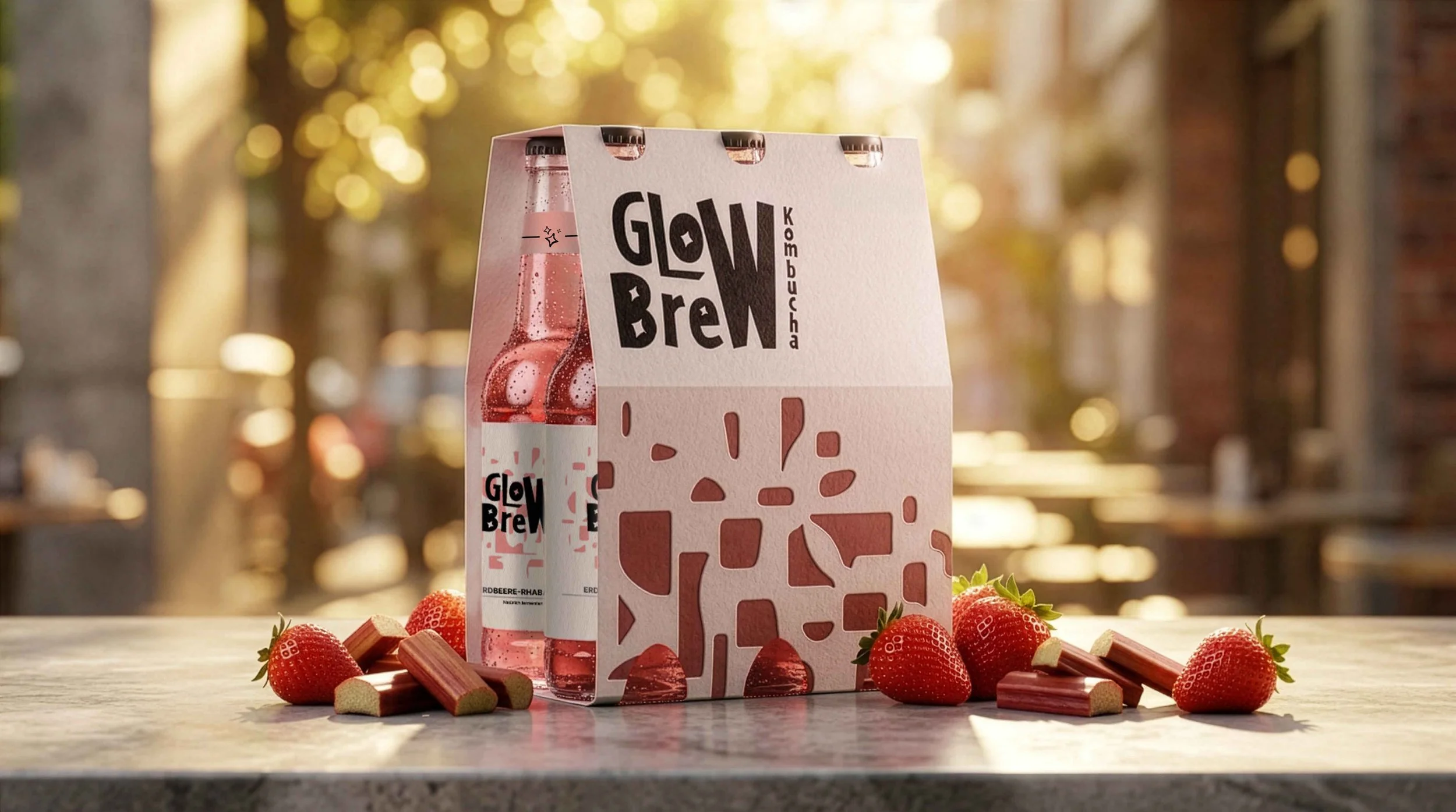
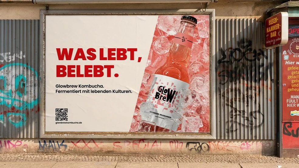
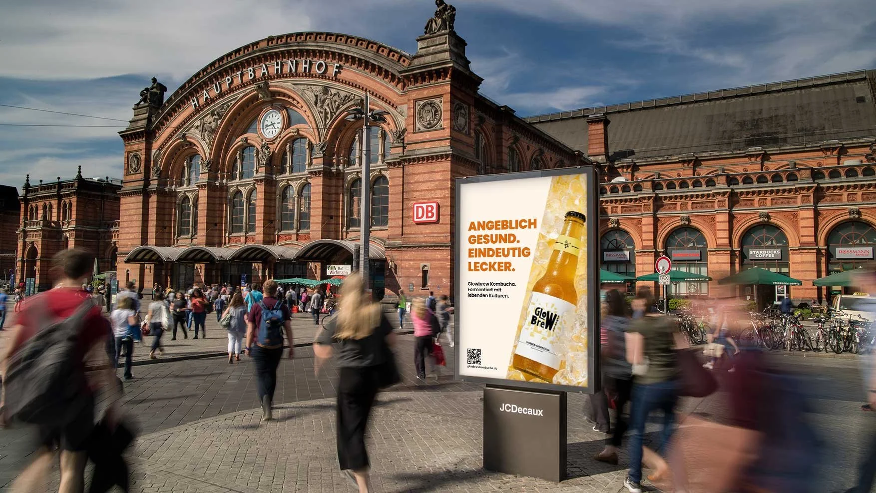
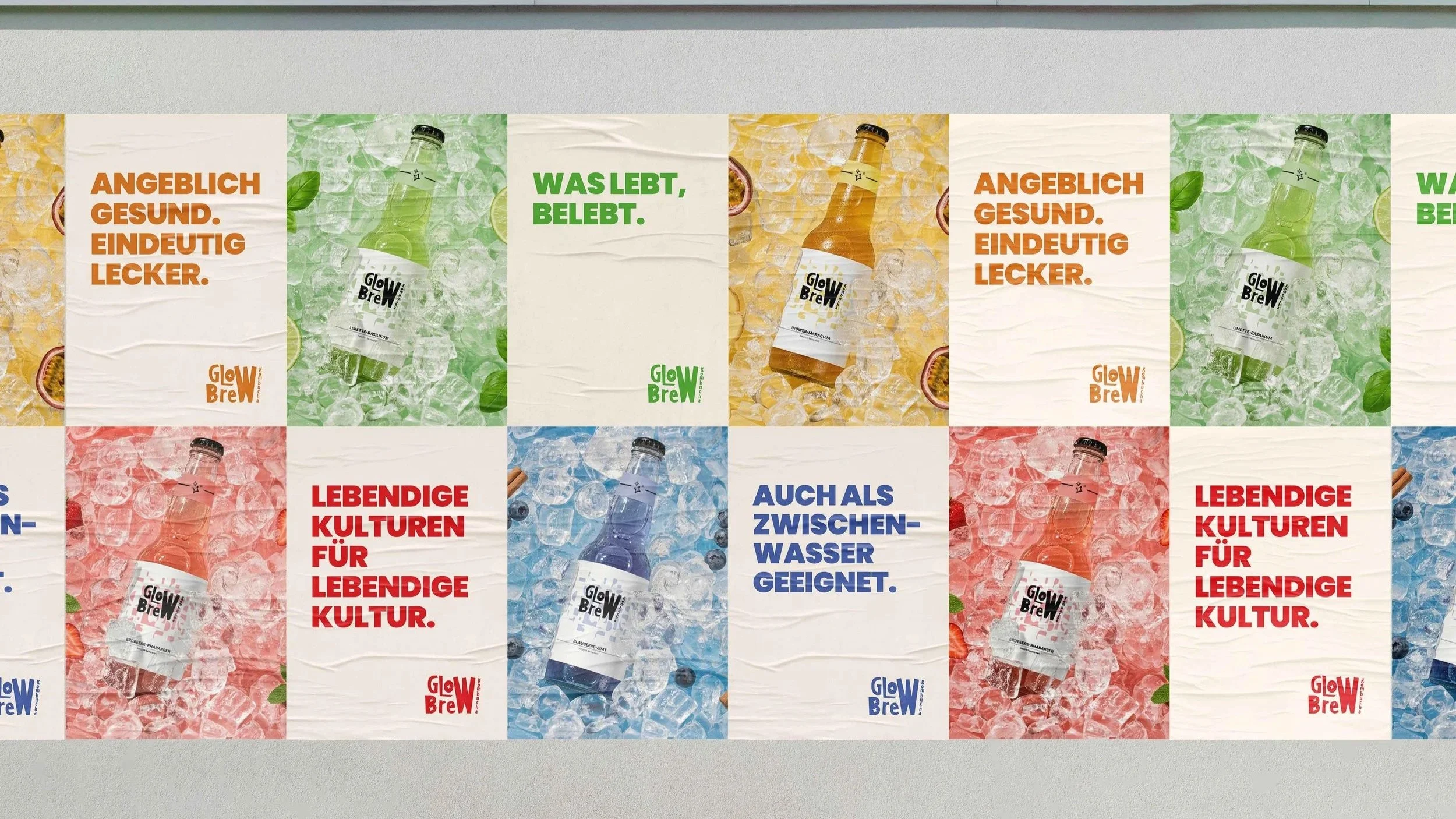
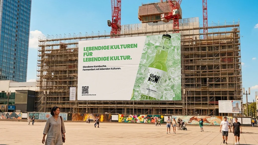
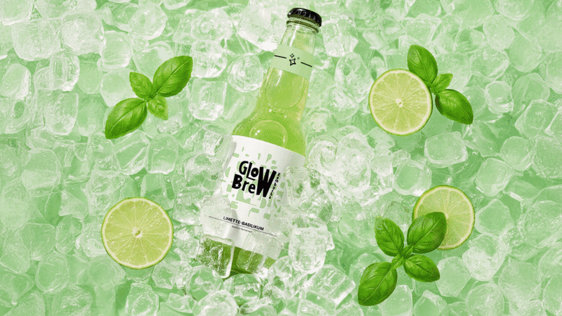
THE BRIEF: Create a bold and contemporary brand identity for Glowbrew Kombucha including logo, packaging, color system and a ooh campaign. The goal was to position kombucha as an easy, everyday drink that feels healthy without relying on typical wellness clichés.
INSIGHT: People want to live their lives normally without constantly thinking about being healthy. They are looking for choices that fit naturally into their routine in a casual and effortless way without making a big deal out of it.
IDEA: Glowbrew communicates its benefits without taking itself too seriously. Instead of classic wellness messaging, the brand uses playful language and relatable, everyday situations to make health feel light and approachable.
The tone is witty, slightly ironic, and easy to connect with, turning kombucha from a typical health product into a natural part of social life.